Customize Consent Banner Widgets
You can tailor how the consent banner, floating cookie button, and modal look and behave so they fit your site.
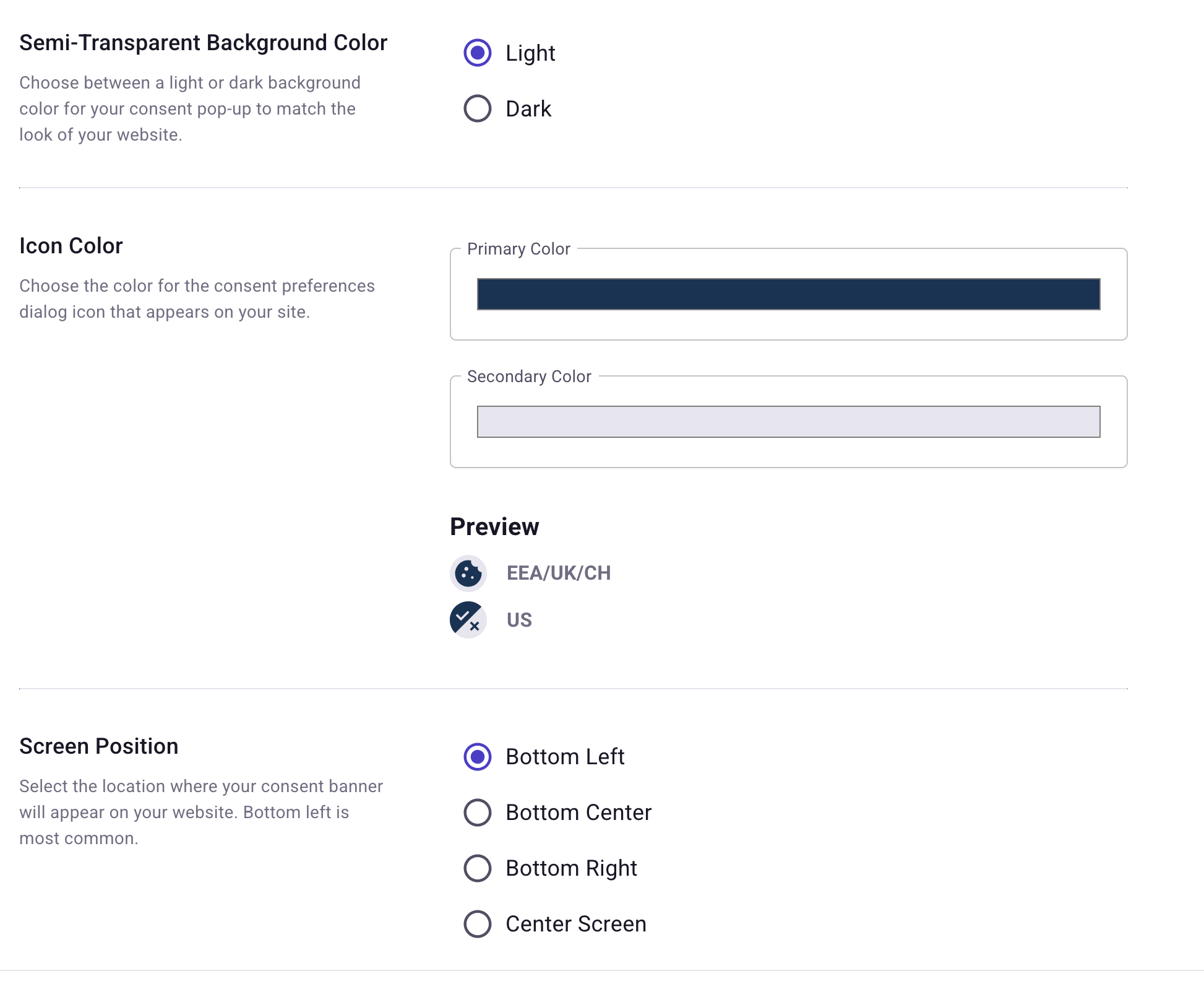
Most appearance options—such as theme color, icon color, and screen position—are configured in the TrueVault Privacy Center under Website consent. Use this guide when you need behavior or styling beyond those controls.
Optional JavaScript configuration
You can also adjust banner behavior with JavaScript options—useful when Privacy Center alone doesn’t cover what you need.
window.polarisOptions
Set window.polarisOptions in a script tag before the polaris.js script loads.
Supported flags:
| Setting | Type | Default | Description |
|---|---|---|---|
hideCookieButton | boolean | false | Hide the floating cookie button that opens the consent modal. Applies after the user has already saved preferences; first-time visitors still see the consent banner until they choose. |
Example
<!-- Start of TrueVault Polaris Code Block -->
<script>
  window.polarisOptions = {hideCookieButton: true};
</script>
<script src="https://polaris.truevaultcdn.com/static/pc/<your unique ID>/polaris.js"></script>
<!-- End of TrueVault Polaris Code Block -->
Visitors should generally have an obvious way to revisit cookie choices later—for example from the site footer or your privacy notice. If you set hideCookieButton to true, add a link that adds ?polaris.openConsentManager=true to the current page URL so the CMP can open the modal for them (see below).
Re-open the modal with a link on the current page
Polaris watches for anchors whose URL includes polaris.openConsentManager=true. You can also add the CSS class truevault-polaris-open-consent-manager-link. Polaris shows or hides those links based on your banner configuration (for example, they stay hidden when the banner is not interactive).
Use a relative URL so the visitor stays on the same page—for example:
<!-- Always visible -->
<a href="?polaris.openConsentManager=true">Cookie settings</a>

<!-- shows only if the current region's banner has consent options -->
<a href="?polaris.openConsentManager=true" class="truevault-polaris-open-consent-manager-link">
  Manage cookies
</a>
CSS custom properties
Turn on Allow custom styles in the consent banner configuration before relying on CSS overrides. That lets your site’s styles affect the banner—only enable it when you actually need custom styling.
Target selectors with JavaScript or CSS
Many banner elements expose CSS classes you can target from your own scripts or stylesheets. Inspect the rendered HTML in your environment to choose selectors that stay stable for your use case. These selectors usually start with polaris-.
See the MDN guide on using the Document Object Model if you need a refresher on selecting elements.
See using CSS custom properties on MDN for how inheritance and specificity interact with overrides.
Banner CSS Variables
Default CSS variables for the consent widgets live on #polaris-consent-widgets. Override any of them in your own stylesheet.
#polaris-consent-widgets {
  --padding: 16px;
  --shadow: rgba(0, 0, 0, 0.25);

  --fab-zindex: 999999;
  --banner-zindex: 999999;
  --modal-zindex: 999999;

  --container-width-desktop: 1140px;
  --container-width-tablet: 720px;
  --container-width-mobile: 396px;

  /* Buttons */
  --button-border-radius: 0;

  /* Colors */
  --link-color: #007bbd;
  --success: #5331c6;

  --white: #fff;
  --gray-lighter: #ececec;
  --gray-light: #b4b4b4;
  --gray: #7c7c7c;
  --gray-dark: #444444;
  --gray-darker: #212121;
  --black: #000;

  --border: var(--gray-light);
  --border-dark: var(--gray-dark);
  --surface: var(--white);
  --text: var(--gray-darker);
  --primary: var(--gray-dark);
  --primary-contrast: var(--white);

  /* Fonts */
  --font-family:
    -apple-system, BlinkMacSystemFont, avenir next, avenir, segoe ui,
    helvetica neue, helvetica, Cantarell, Ubuntu, roboto, noto, arial,
    sans-serif;
  --heading-font-family: var(--font-family);
  --button-font-family: var(--font-family);

  --size-base: 14px;

  --size-h1: calc(var(--size-base) * 1.5);
  --size-h2: calc(var(--size-base) * 1.25);
  --size-h3: calc(var(--size-base) * 1.125);
  --size-h4: calc(var(--size-base) * 1);
  --size-h5: calc(var(--size-base) * 0.95);
  --size-h6: calc(var(--size-base) * 0.85);

  --size-sm: calc(var(--size-base) * 0.85);
  --size-xs: calc(var(--size-base) * 0.5);

  /* Modal */
  --modal-max-width: 720px;
}
Exact defaults can change as the product evolves; confirm behavior in your staging environment after upgrades.